Finally, customer experiences that are best in class. A success story featuring the Escondido Union School District (EUSD)
The Problem
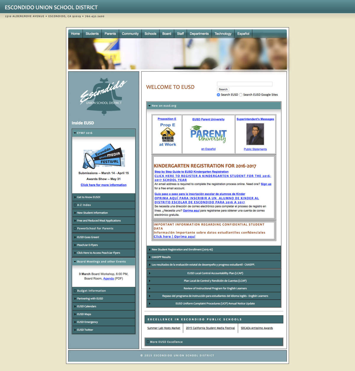
EUSD is the sixth-largest elementary school district in California. In 2015, they were dealing with declining enrollment, largely due to competition from charter schools. Making matters worse, their marketing was nonexistent, and their old district website was cluttered and hard to navigate:
Recognizing their need, EUSD’s internationally-renown Technology and Innovation department initiated an RFP for a custom website redesign with significant strategic marketing and customer experience (CX) components. EUSD invited Deedub Inc. to submit a proposal after seeing the quality of my work on a similar project for the California Center for the Arts, Escondido.
Ultimately, Deedub Inc. won the bid, and the project was especially meaningful to me because I attended EUSD schools from Kindergarten through 8th Grade.
Quick Summary: Highlights and Impact
The website redesign took just over six months from start to finish, and the new eusd.org launched in August 2016 — on time, and just before the start of the new school year:
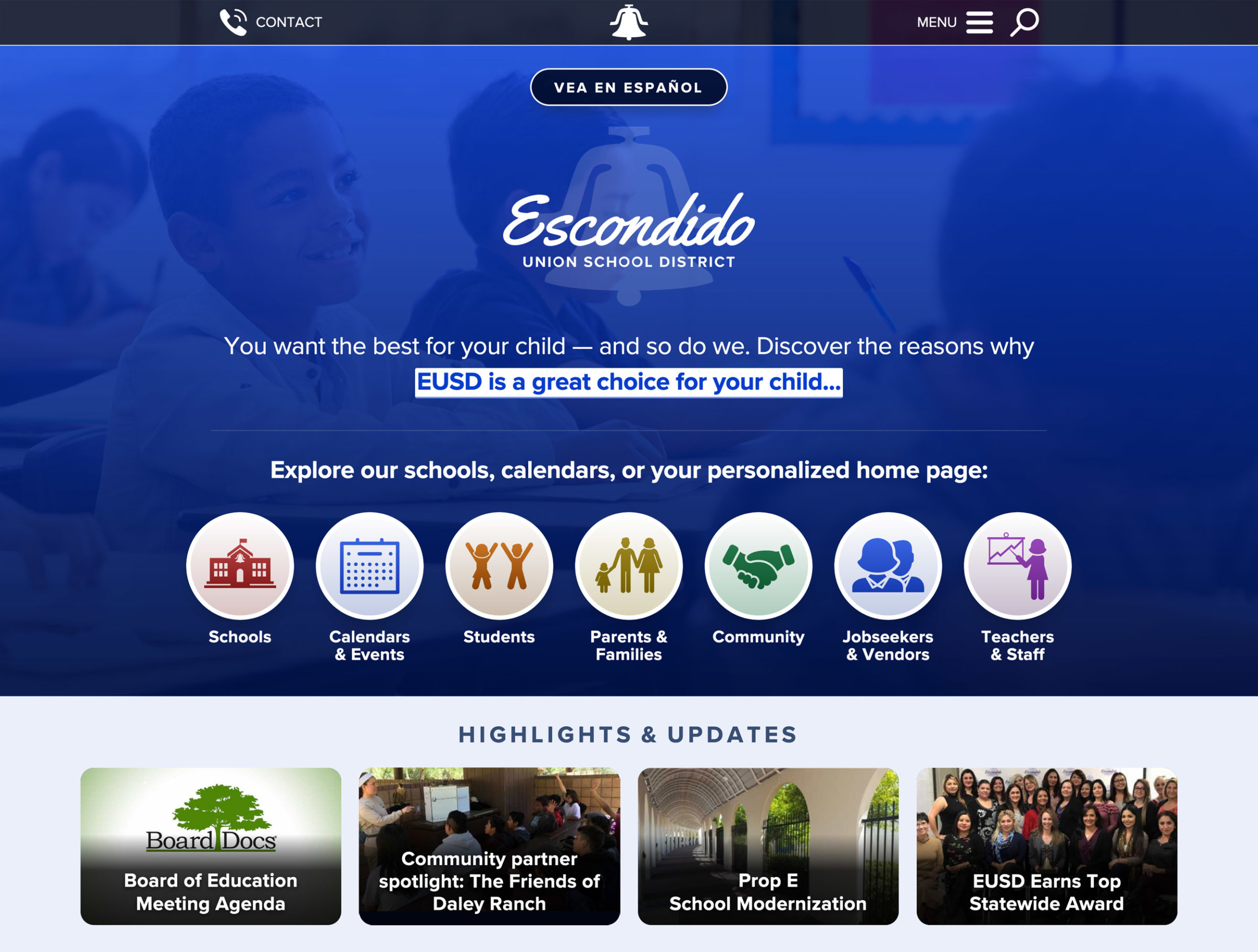
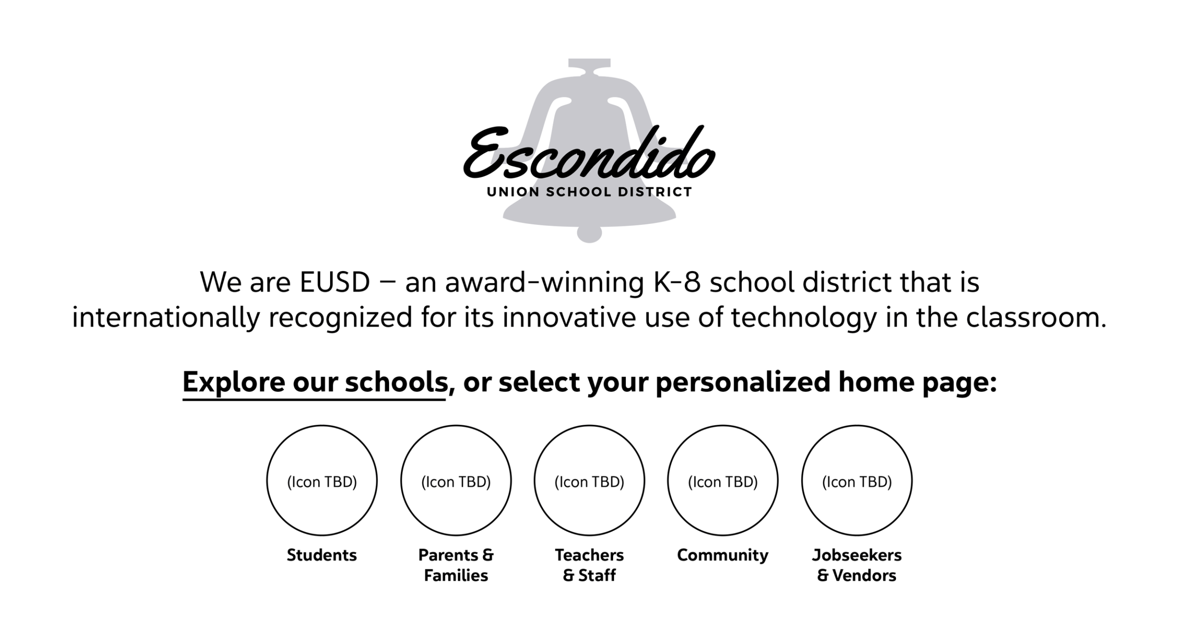
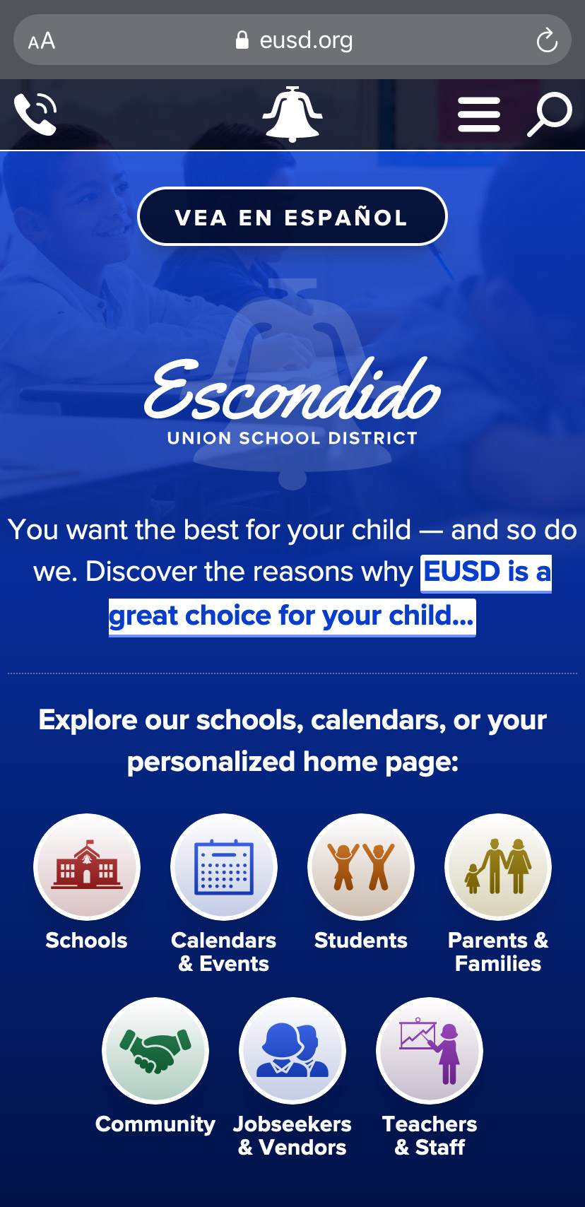
The top navbar is black in color with white icons and text. It contains four elements: At center, the school bell icon from EUSD’s logo. At left, a “Contact” button. And at right, a “Menu” button, followed by a magnifying glass icon that reveals an expandable search bar when clicked. Below the top navbar is a Spanish translation button that reads “Vea en Español.” Below that is a large, standard version of EUSD’s logo with Escondido Union School District text overlay. Below that is a full-width blue banner for featuring important content. In this case, the banner reads: “You want the best for you child — and so do we. Discover the reasons why EUSD is a great choice for your child,” with the final words of that sentence being a clickable link to go to a subpage for more info. The background of the banner is a photo of a male latino student smiling in a classroom. Below the banner, the menu of seven buttons begins with a transition sentence that reads: “Explore our schools, calendars, or your personalized home page.” The seven buttons are white circles with colorful icons in the middle, and a label below. The buttons are labeled, in order: “Schools”; “Calendars & Events”; “Students”; “Parents & Families”; “Community”; “Jobseekers & Vendors”; and “Teachers & Staff”. Below the menu is another region for featuring special content, entitled “Highlights and Updates.” It contains four rectangular buttons, each with a photographic background image and a text overlay to entice the reader to click it and read more on its associated subpage. End of detailed image description.
Equitable access for people with disabilities is critical in public schools, so I designed and coded the website’s templates to be highly accessible under the Web Content Accessibility Guidelines (WCAG).
I also launched and actively managed multiple strategic marketing and content initiatives that complemented the website, enhanced the overall customer experience, and improved community awareness and perceptions of EUSD.
Notable marketing, content, and CX achievements included:
Growing EUSD’s Facebook page from less than 200 to nearly 1,500 followers over two years (mostly organic with minimal ads). I shared publishing duties with staff and mentored them on best practices, resulting in an estimated 15,000 to 25,000 post views per month during year one.
Publishing EUSD’s first-ever bilingual email newsletter to over 17,000 recipients each month with open rates of 23 – 43%.
Targeting prospective parents by creating Why EUSD: a college admissions-style section of the new site. I also recommended offering school tours, and I made a tour request form easily accessible from Why EUSD and other areas of the site, resulting in a hundreds of tour requests.
EUSD was so pleased with the results that they renewed my contract multiple times, leading to a successful four-year relationship. I was even entrusted with providing extensive group and one-on-one trainings and mentoring to numerous district staff members.
The impact of our partnership led to rave reviews from EUSD leadership and actual users:
“Dave has a really unique, multidisciplinary skill set, and he’s full of great ideas. He didn’t just do amazing CX, UX, and marketing work for EUSD — he also taught and empowered us to be self-sufficient. I can’t believe how much we learned from Dave about strategy, design, marketing, accessibility, and more.”
Director of Technology and Innovation (Retired)
“I honestly love our district website. Its interface organizes information for parents, staff, and community members. The design is simple and very teacher friendly. It makes it easy to search for teacher resources and help parents get connected. It’s so clear they were listening to our community when designing our site.”
EUSD Teacher
Want to learn more? Read on for a deep dive into my methodical, collaborative process.
Or, if you’re short on time, select the section that interests you most:
- Phase 1: Research and Strategy
- Phase 2: Design and Development
- A Closer Look at the Finished Product
- Phase 3: Strategic Marketing and CX
Phase 1: Research and Strategy
I began the project with an extensive, two-month-long research and empathy phase, which included:
- Meeting with the superintendent’s executive cabinet on multiple occasions to learn about their needs and strategic goals.
- Conducting interviews, focus groups, and surveys to discover the needs and frustrations of critical stakeholder groups, including parents, teachers, staff, administrators, and community members.
- Reviewing Google Analytics data from all existing EUSD websites to determine top content.
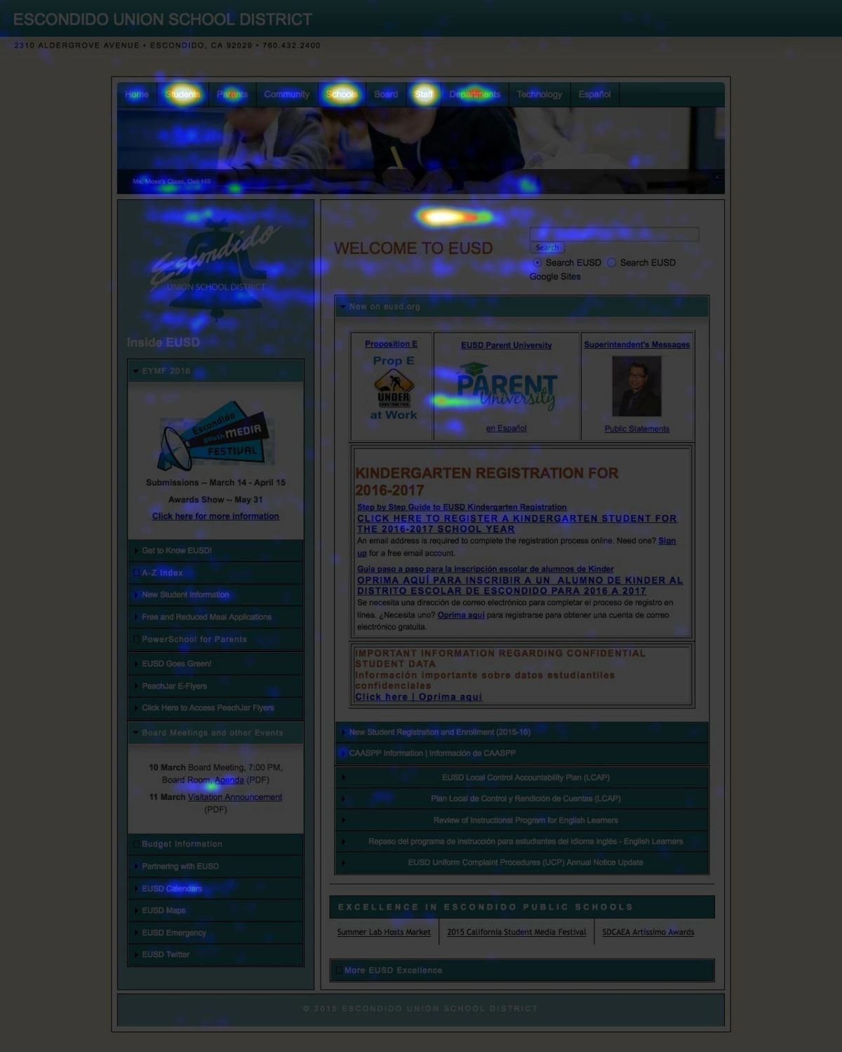
- Utilizing heatmapping on the old district website to visualize user needs and behaviors. These heatmaps made an immediate and obvious impact on EUSD’s executive cabinet, convincing them of what wasn’t working, and making it easier for them to embrace the culture change needed to make the project a success:
My research revealed five strategic priorities that drove all project management, design, and development:
- The new website would need to be organized and designed around an audience-centric approach so that each of EUSD’s different stakeholder groups would only see content relevant to them.
- To make the audience-centric approach a success, the new site’s content management system (CMS) would need a highly-customized tagging workflow to route audience-specific content to appropriate pages.
- Due to budgetary and staffing limitations, all aspects of the CMS (including audience tagging) would need to be as intuitive as possible so that EUSD staff could easily maintain the site after my consulting contract ended.
- Due to the large number of Spanish-speaking parents within EUSD, we would need to publish some site content in both English and Spanish, and work with the district’s staff translator to develop a translation workflow.
- Surprisingly, many people were unaware of EUSD’s significant advantages and award-winning programs. As a result, we would need to sell the benefits of EUSD to prospective parents (both on the new website and beyond), much like universities pitch themselves to prospective students.
With buy-in from the superintendent’s cabinet on these strategic priorities, we moved on to the next phase of the project.
Phase 2: Design and Development
Over the next four months, I worked closely with EUSD’s talented Technology and Innovation team to build and launch the new site. I served as de facto project manager, coordinating meetings and allocation of critical tasks.
Noteworthy design and development milestones included:
Modernizing the building blocks of EUSD’s look and feel
The district’s colors, fonts, and other design elements were either unrefined or completely undefined. As a result, we scrutinized and standardized everything with a particular emphasis on achieving a high level of WCAG accessibility.
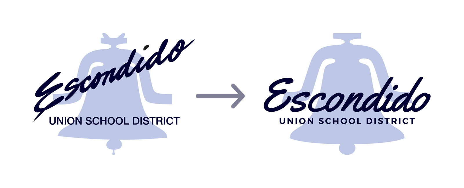
I also modernized EUSD’s beloved, long-time school bell logo to be more readable and recognizable at any size:
Choosing WordPress as CMS and customizing it to the extreme, including on-screen trainings
WordPress was chosen due to its flexibility and massive library of powerful plugins. Using a mix of plugins and custom PHP code, I redesigned the appearance and functionality of the WordPress dashboard and editor interface to accomplish three things:
- Create the tagging workflow needed to route audience-specific content to the correct areas of the website.
- Reformat the WordPress editor to present content fields logically and sequentially for a more intuitive, step-by-step editing experience.
- Create expandable on-screen training tips right next to each content field. This, combined with extensive in-person trainings, would empower EUSD staff with the skills needed to maintain the website well into the future.
Please note: Due to the proprietary nature of my WordPress trainings and customizations, I can’t show extensive screenshots here. However, I’d be happy to give a private demo.
A groundbreaking redefinition of the home page
During the design process, an idea came to me that was inspired by my research findings:
What if the new EUSD home page consisted of a brief marketing message, followed by a simple menu where users could select their audience with a single touch or click? Doing so would reveal their audience’s home page featuring content custom-tailored to their unique needs.
I created conceptual wireframes to demonstrate this idea:
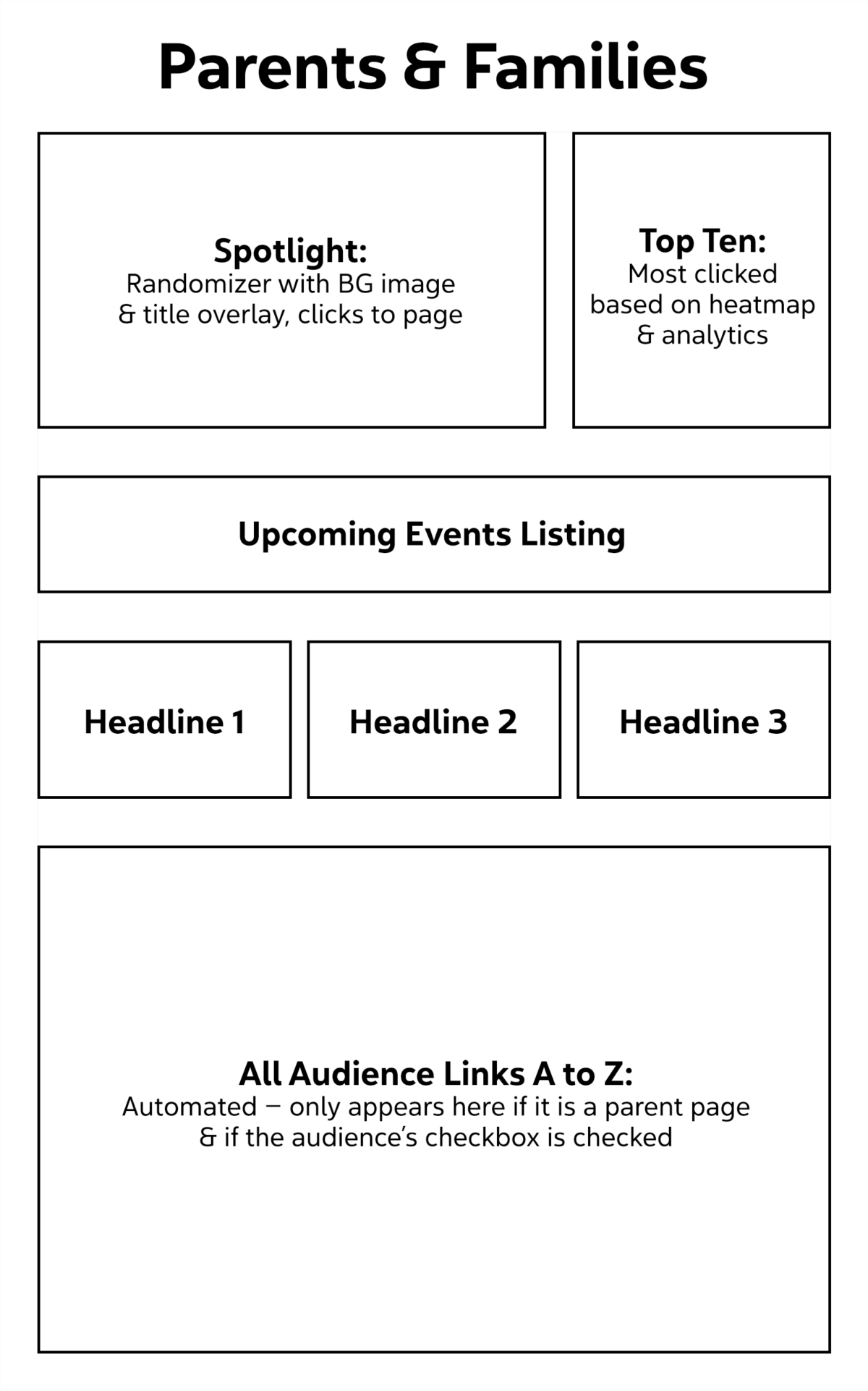
The first region at upper left is called Spotlight. It’s intended to be a large button that randomly features different items at different times. It will have a background image and title overlay and, when clicked, it will go to a subpage for more information on that featured topic. At upper right is a top-ten list of the most-popular links for that audience, based on heatmap and analytics data. At mid page is a region for a listing of upcoming events, followed by a region for news and announcements represented by three buttons, each one teasing a news headline which goes to the full news story when clicked. Finally, there is a large region at the bottom of the page for displaying links to all additional relevant pages for this audience, listed alphabetically from A to Z. End of detailed image description.
The Technology and Innovation team loved this approach, so it became the basis for our final home page designs.
Devising a content strategy and content production plan, including a simple Spanish translation workflow
Working with EUSD staff, we audited content on the old website, all the way down to the PDF level. The result was a comprehensive content strategy that identified what should stay, what should go, what needed to be created, and which audiences should have access to it.
This process also helped us allocate and track content production tasks in the weeks leading up to the site launch, as evidenced by my project management spreadsheet:
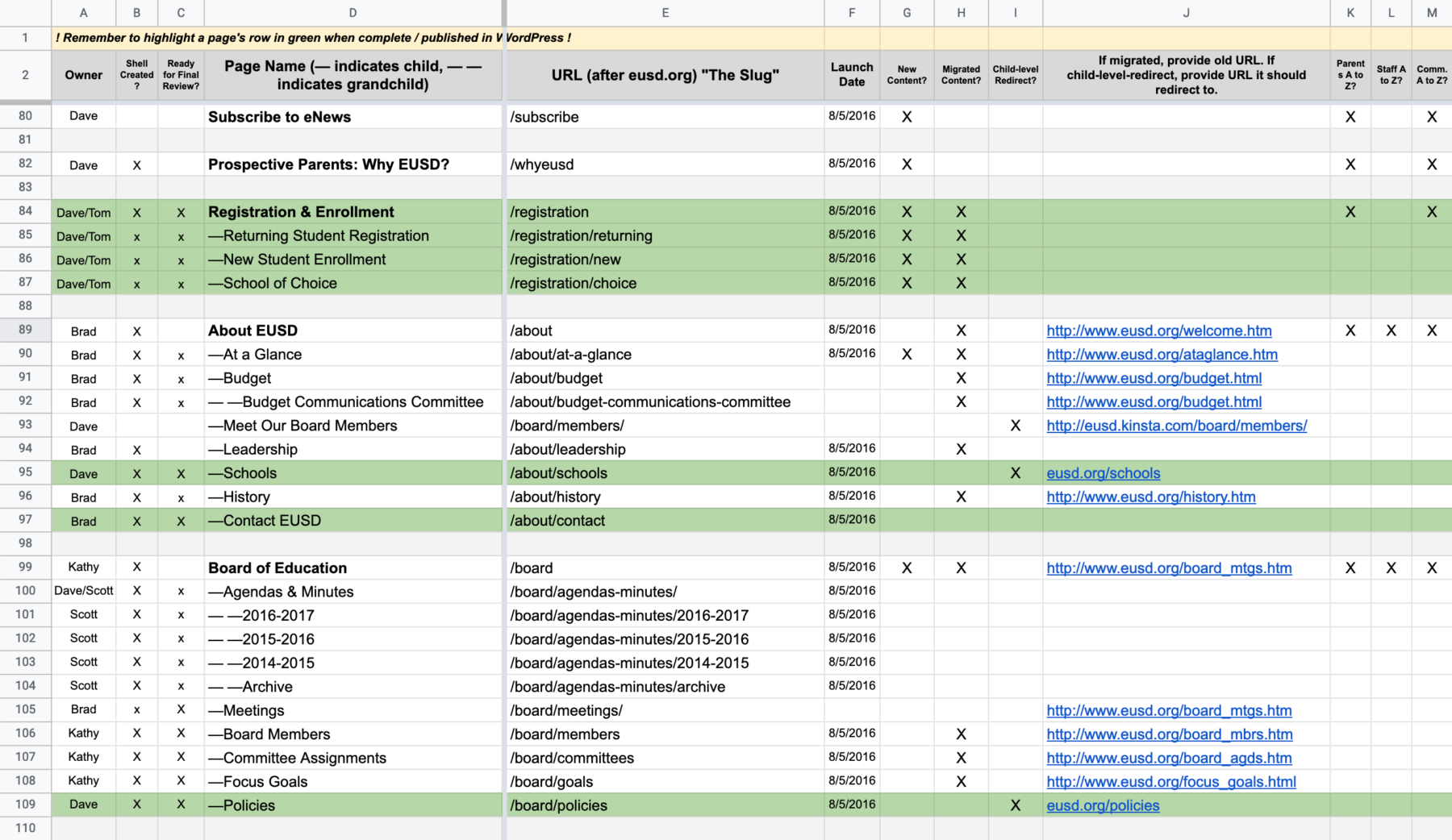
Because this screenshot shows only part of the spreadsheet, I’ll simply summarize important aspects here. Each identified page of content in the new website has its own row. From left to right, the intersecting columns describe important details about that page of content, including: which EUSD staff member is responsible for the page, whether or not the page has been created inside WordPress, whether or not the page is ready for final review, the page’s name, the page’s web address, the page’s anticipated launch date, checkboxes that define whether the page is brand-new content or was migrated from the old website, and checkboxes that define whether or not the page should be tagged for viewing by Parents, Staff, and/or Community members. End of detailed image description.
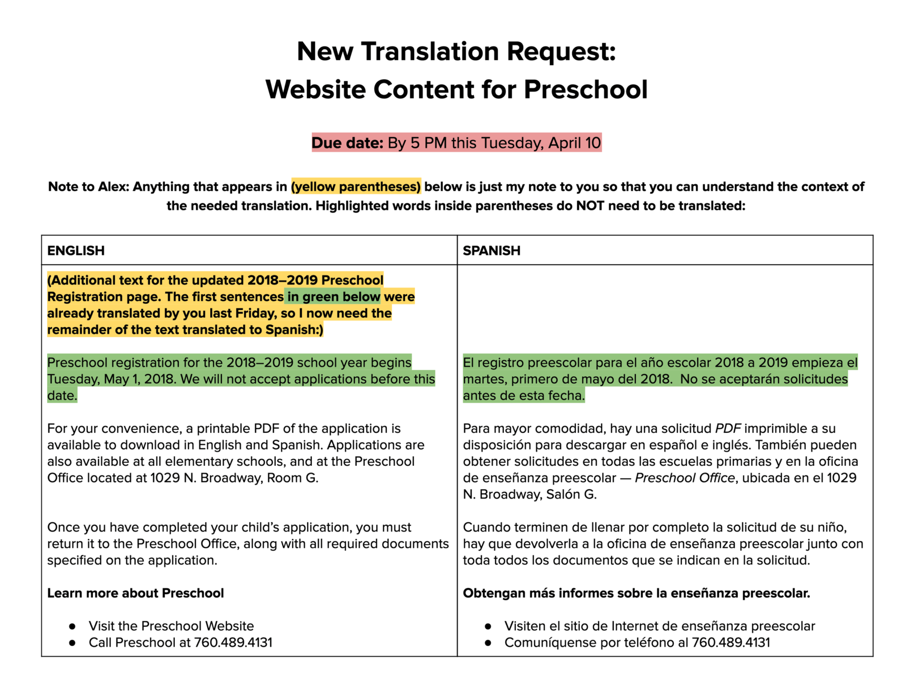
I also developed a strong relationship with EUSD’s staff translator (made possible, in part, by my having taken four years of Spanish in school). Ultimately, I created a simple, two-column Google Docs template where he could easily read source English content and supporting instructions at left, and write in his Spanish translation at right. This allowed him to forego WordPress training in favor of a simpler tool he was already familiar with:
A Closer Look at the Finished Product
Although the new eusd.org was built on WordPress, I did not use an off-the-shelf, cookie-cutter WordPress theme.
Instead, drawing on my years of experience coding HTML and CSS, I created a fully-custom (and highly WCAG accessible) WordPress theme specifically for the unique needs of EUSD.
Beyond the main home page shown at the beginning of this success story, I developed a complete family of content templates, including:
Audience home pages
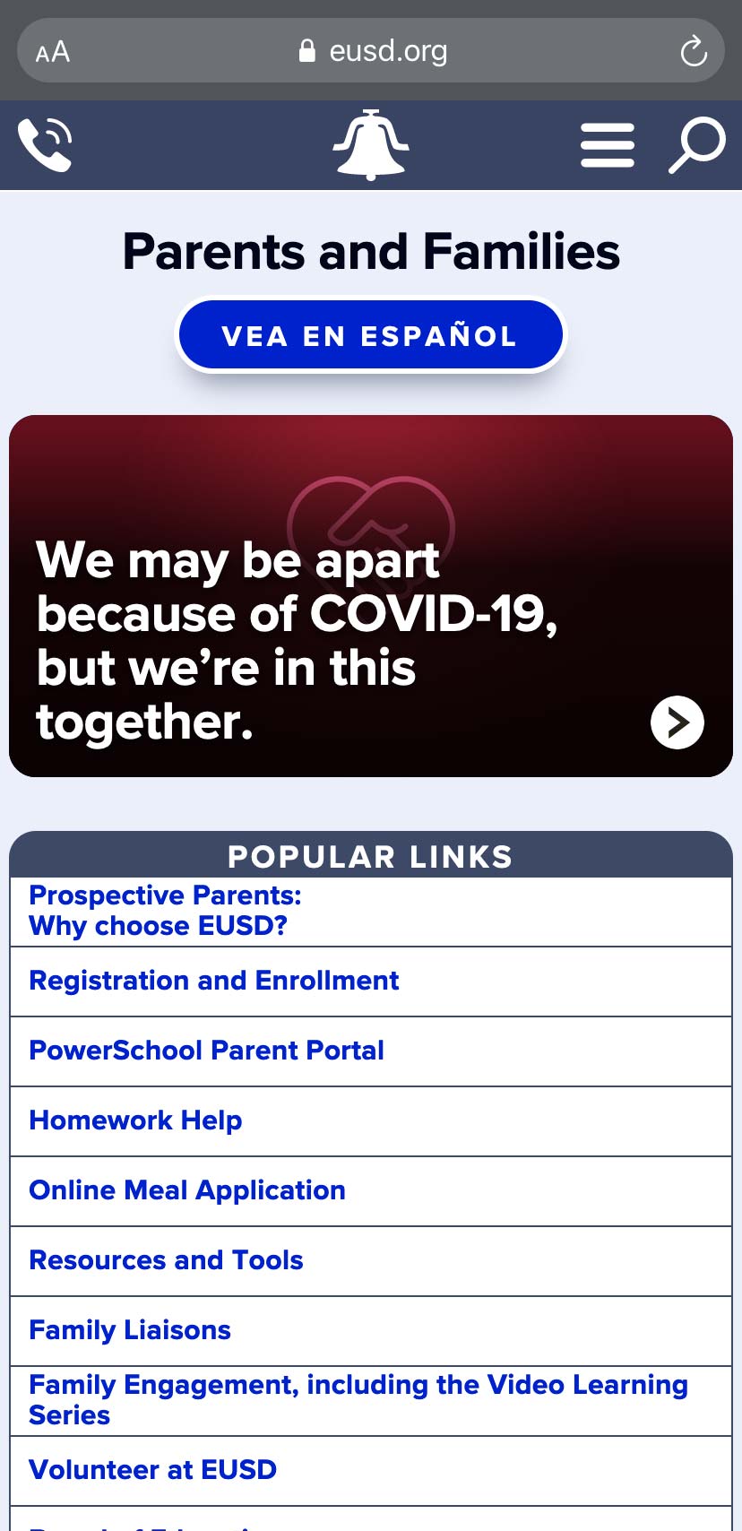
The final audience template was true to our original, research-driven wireframe. It offered different content regions for different purposes, perfectly balancing the marketing communication needs of the district with the practical, day-to-day needs of the user.
Also, notice the prominent “Vea en Español” (ie: View in Spanish) button at the top of the page. The site intelligently senses whether equivalent Spanish content has been published for any given English page and displays this button accordingly — much more intuitive than the obscure translation menu on many websites:
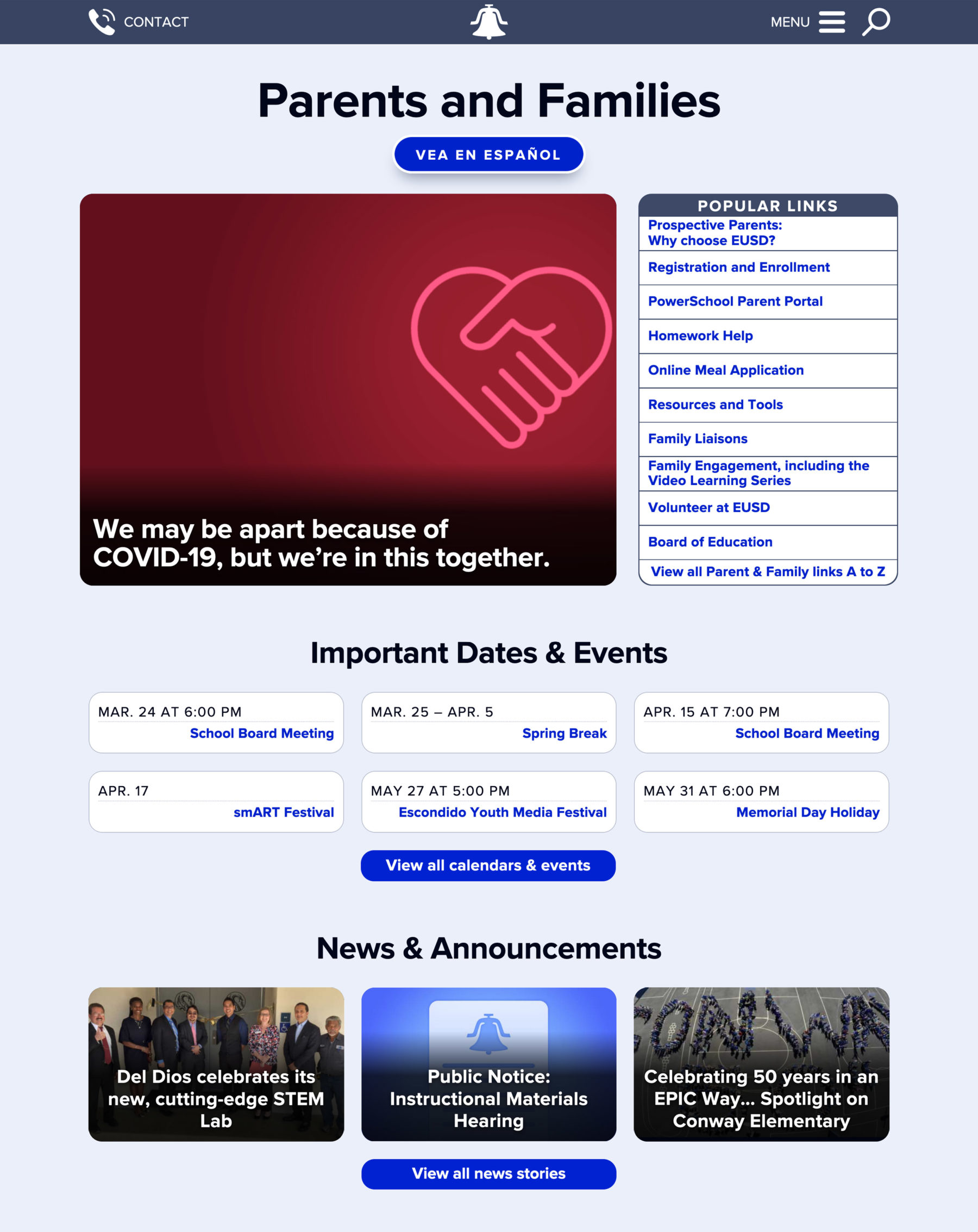
Because the functionality and layout of this page was described in the wireframe moments ago, I’ll briefly describe some of the content shown within this specific screenshot of the page. The large spotlight button at upper left is displaying a red heart icon with the headline “We may be apart because of COVID-19, but we’re in this together.” The Popular Links region at upper right shows the top-ten links for parents, including Registration and Enrollment, the Parent Portal for grades and related info, Online Meal Applications, and Resources and Tools for parents. The Important Dates and Events region mid page shows six upcoming events, including a school board meeting, spring break, special art-related student events, and the Memorial Day Holiday. Each event can be clicked for complete information, and a seventh button below the events clicks through to the complete calendar for all events. Finally, at bottom of page, three News and Announcements buttons are showing, each with a background photo and news headline. Below them is a fourth button to view all news stories in the news section of the website. End of detailed image description.
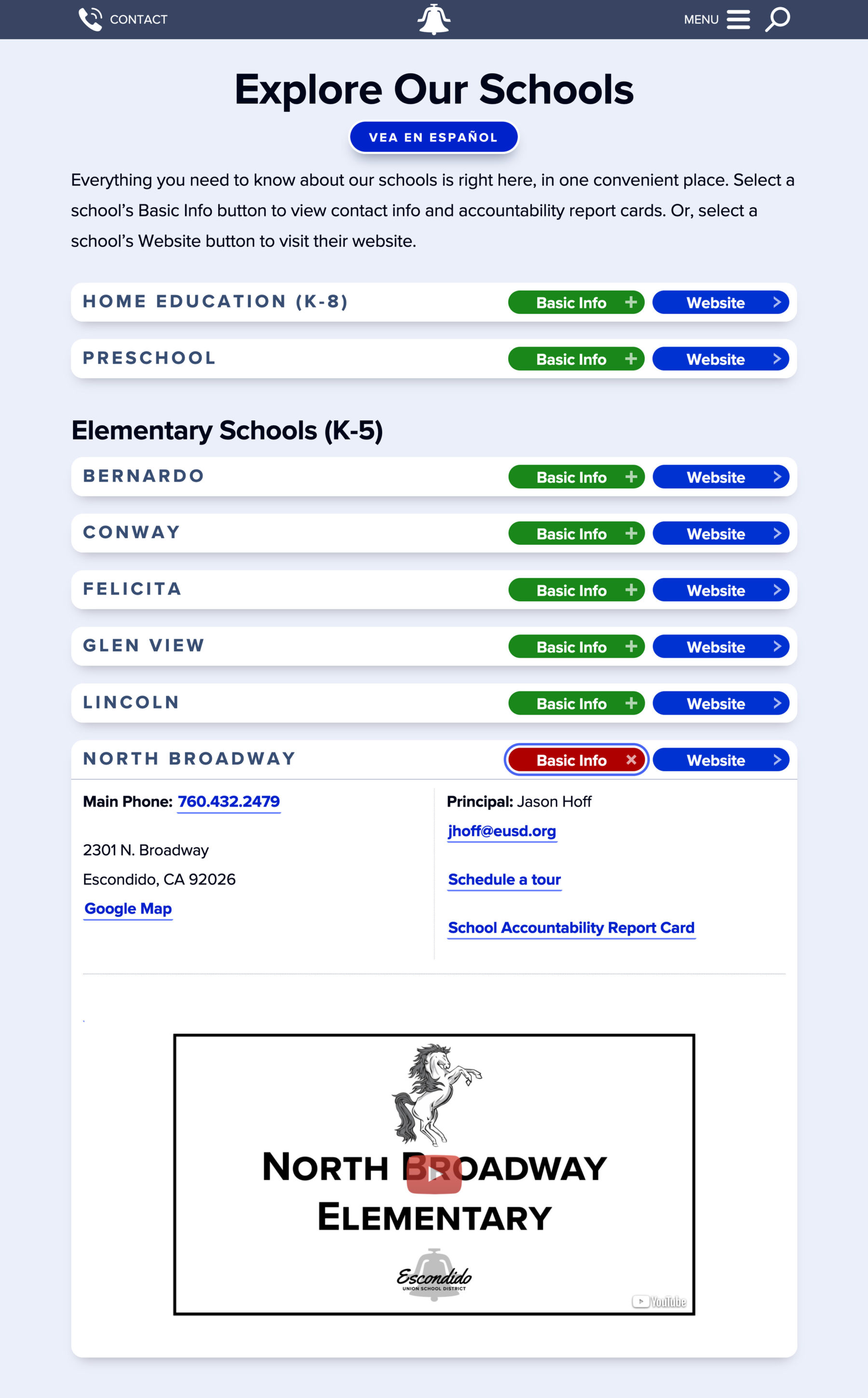
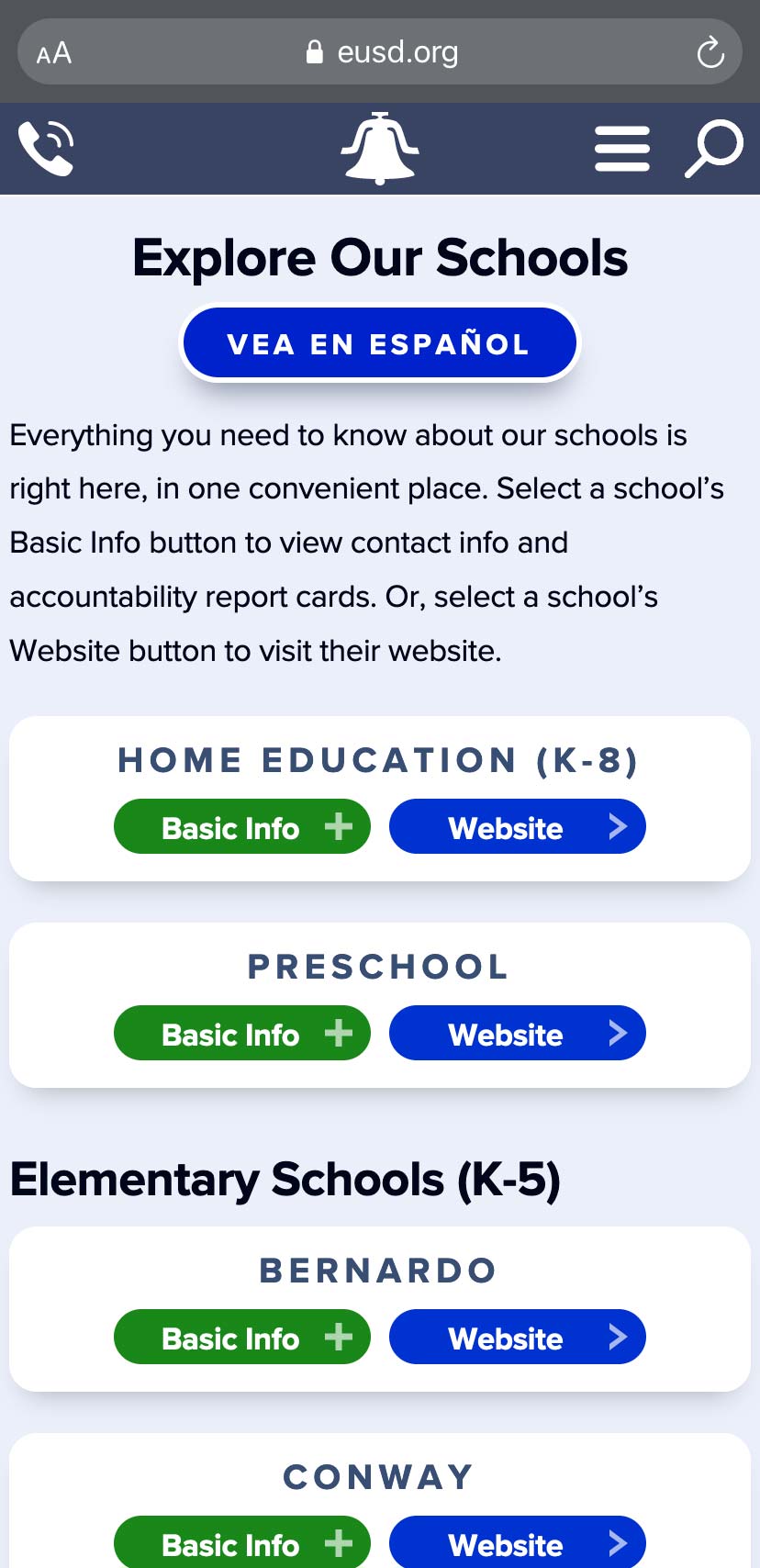
The schools subpage
With 23 schools, plus home education and preschool, we needed a way for people to quickly access school-specific content. Our schools page layout accomplished this by offering a choice between expanding an “accordion” of basics (like contact info, the principal’s name, tour requests, accountability report card, and a welcome video), or clicking a button to go to the stand-alone school website for comprehensive info:
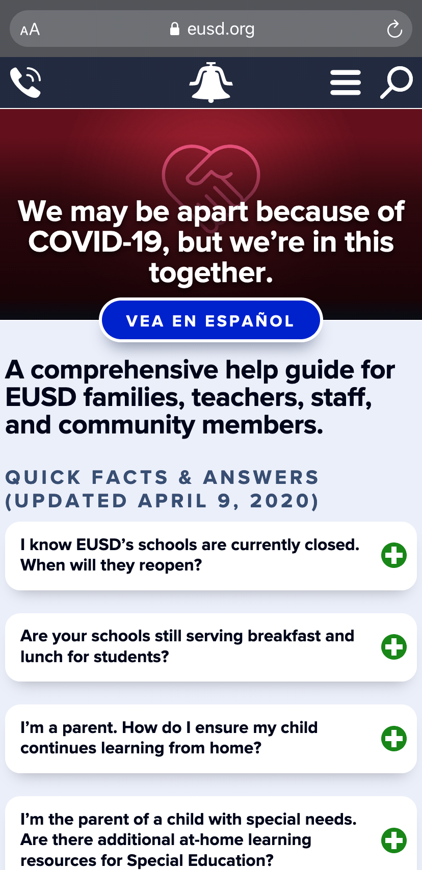
Standard subpages
Notice the optional, full-width banner image, plus a variety of CSS-driven formatting options in the main content area:
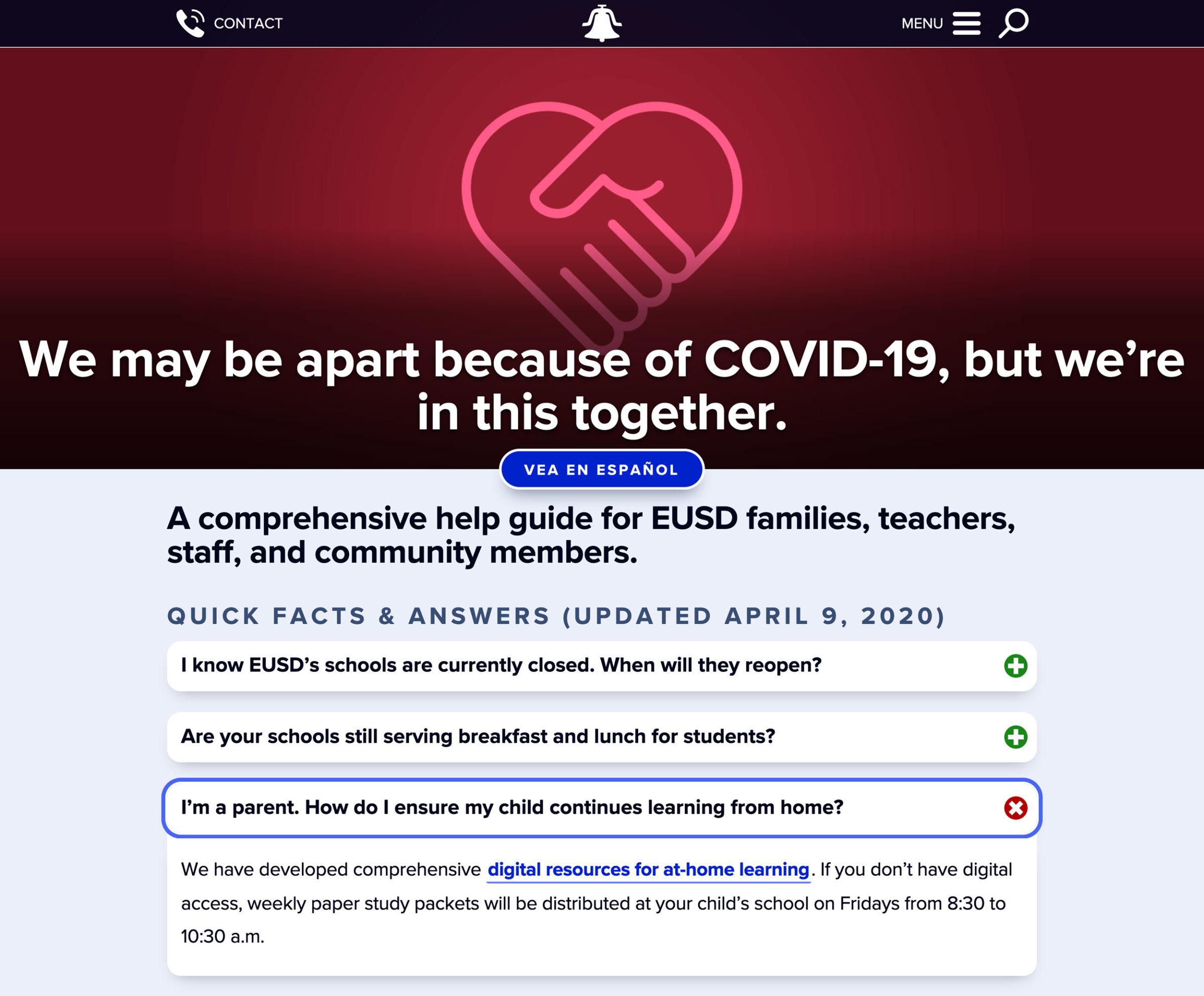
The banner contains a large red heart image with a COVID-19-related headline. Below the banner is a Vea en Español button for Spanish translation. Below that is a listing of three important questions, quick facts, and answers related to COVID-19, school closures, and distance learning. The quick facts are accordion boxes, and the first two are collapsed by default, but the third is expanded indicating someone clicked it to view the information. End of detailed image description.
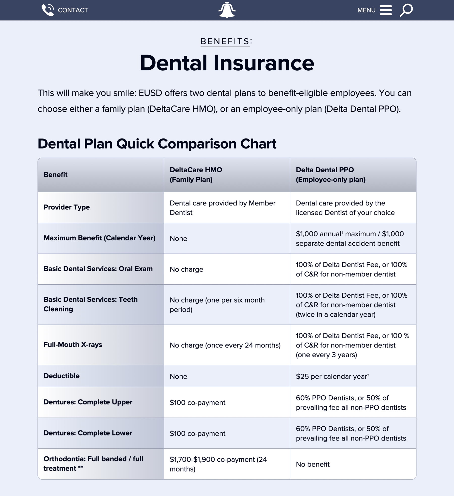
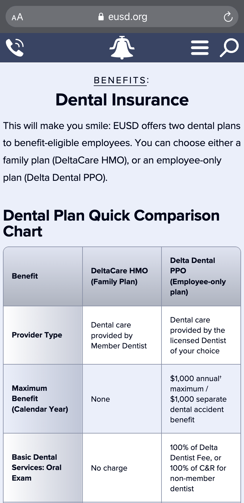
The page headline reads: “Benefits: Dental Insurance.” Below the headline is an intro sentence that reads: “This will make you smile: EUSD offers two dental plans to benefit-eligible employees. You can choose either a family HMO plan or an employee-only PPO plan.” Below that is a three-column table. Each row highlights a specific benefit or feature of the dental plans, and the columns organize those benefits by type of plan for quick comparison (family HMO is in column 2, and employee-only PPO is in column 3). End of detailed image description.
Best of all, every template is fully responsive for fast, optimal viewing on any device, including smartphones:
Phase 3: Strategic Marketing and CX
As I mentioned earlier, Why EUSD is a key feature of the site. Modeled after a college admissions website, Why EUSD acts as a welcoming entry point for prospective parents, offering ten dedicated subpages that tell the story of the district’s biggest strengths and advantages. I selected these “selling points” and wrote all Why EUSD content after extensive consultation with district staff and leadership during the research phase of the project:
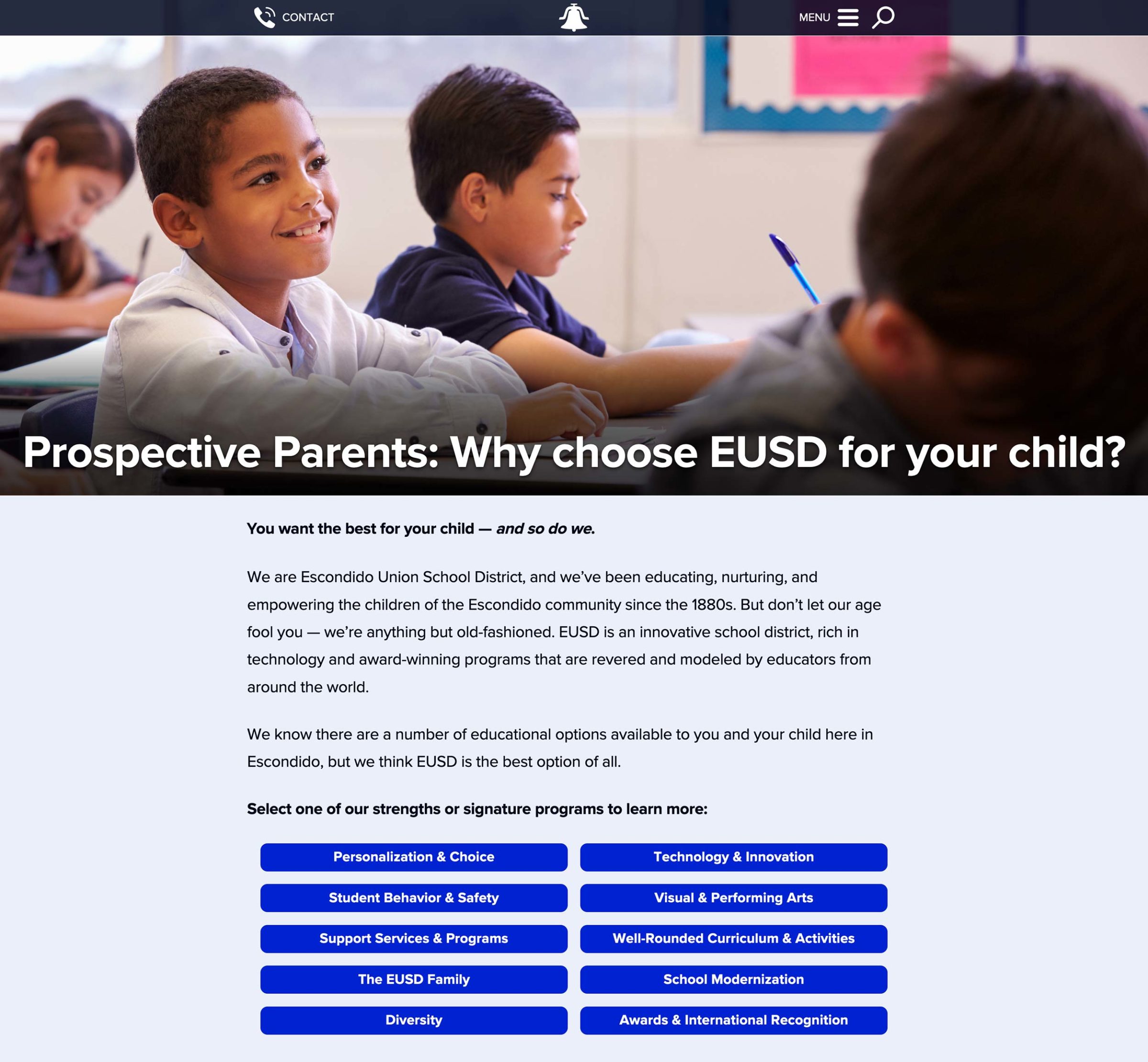
The page has a large banner image of a male latino student smiling inside a classroom with a superimposed headline that reads: “Prospective Parents: Why chose EUSD for your child?” Below are four brief paragraphs that read: “You want the best for your child — and so do we. We are the Escondido Union School District, and we’ve been educating, nurturing, and empowering the children of the Escondido community since the 1880s. But don’t let our age fool you — we’re anything but old-fashioned. EUSD is an innovative school district, rich in technology and award-winning programs that are revered and modeled by educators from around the globe. We know there are a number of educational options available to you and your child here in Escondido, but we think EUSD is the best option of all. Select one of our strengths or signature programs to learn more.” Then the page concludes with ten blue buttons for each of those signature programs: “Personalization and Choice.” “Technology and Innovation.” “Student Behavior and Safety.” “Visual and Performing Arts.” “Support Services and Programs.” Well-rounded Curriculum and Activities.” “The EUSD Family.” “School Modernization.” “Diversity.” And “Awards and International Recognition.” End of detailed image description.
But merely having such a critical resource means nothing if people don’t utilize it. They need to be able to find it, and it needs to convert, leading them to the next step in their customer journey.
That’s why I helped EUSD launch an extensive strategic marketing campaign to fight back against negative perceptions of the district (and public schools in general), and drive traffic to Why EUSD. The campaign was centered around a slogan I created in response to common emotions that emerged during the research phase:
“You want the best for your child — and so do we.”
The campaign reached out to parents through a number of channels, including Facebook, a monthly email newsletter, and “good news” articles on the EUSD website. I created a significant amount of content for each channel.
We even created a 30-second video ad that ran in the #1 position before every movie and showtime at Escondido’s movie theater during the busy 2016 holiday season. EUSD staff shot and edited the ad, and I wrote the voiceover script and negotiated the ad buy with the theater rep. We also simulcast it on Facebook, where it became one of EUSD‘s most popular posts.
But great marketing doesn’t just sell — it helps.
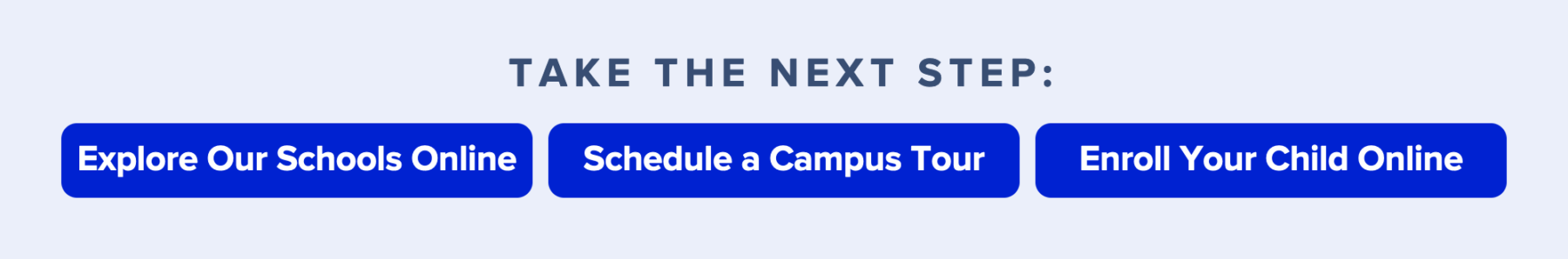
Choosing where to educate your child is a big decision, and we recognized that different parents would be at different phases in their decision-making process. As a result, we placed three distinct calls to action at the end of each Why EUSD subpage to provide helpful next steps for every parent, regardless of where they are in their customer journey:
I also coordinated with EUSD enrollment staff to ensure that all registration-related content was consistent across every digital and physical touch point, including Why EUSD, online registration systems, Facebook, email, and paper packets and letters mailed home. The result was a more cohesive, end-to-end customer experience that made the registration and enrollment process less intimidating for parents.
In fact, my emphasis on big-picture CX is why the overall project was so successful.
If we had treated it as a mere website redesign, we would have ended up with one great experience, and a bunch of others that were lackluster. The customer journey would have been incomplete and full of friction.
Instead, we scrutinized absolutely every experience — including essential underlying elements of employee experience (like training) — and we integrated them in a seamless fashion. That’s why EUSD is now able to offer CX that’s best in class, and I’m very proud of my role in making it happen.