Forward-thinking solutions for a modern university. A success story featuring California State University San Marcos (CSUSM)
Quick Summary
Prior to founding Deedub Inc., I worked in the Office of Communications at Cal State San Marcos from February 2008 until October 2013.
At the time, CSUSM was nearly 20 years old and growing rapidly. With new programs coming online and a first-ever capital campaign on the horizon, university leadership was looking to advance their strategic goals, which included improving CSUSM’s marketing, fundraising, and digital experiences.
As part of that effort, I was hired as Web Communications Specialist, and I was one of the first people in the Cal State system to hold that position. The role was intended to function as a content strategist for the university, and I immediately joined a cross-departmental leadership team of 6–7 people that directed and implemented two successful website redesigns.
However, people quickly realized the extent of my multidisciplinary skill set, and my role expanded to include a number of design and strategic responsibilities related to brand, marketing, creative direction, and user experience. Accordingly, my position was renamed twice to reflect my diverse and growing list of responsibilities and accomplishments.
Ultimately, I came to be viewed as a trusted leader, advisor, and partner to many people at CSUSM, including my direct supervisor:
“At CSUSM, Dave consistently produced quality, innovative work that exceeded expectations. He’s truly multidisciplinary: a polished writer and presenter, a talented designer and technologist, always focused on strategy and long-range impact. But equally important, he’s a thoughtful and caring person.”
Vice President, University Advancement (Retired)
Before you continue, an important note:
Unfortunately, I can’t show extensive visuals of my CSUSM design work here (primarily out of respect for copyrighted material).
Instead, this success story will describe my responsibilities and results on both design and non-design projects.
However, I’m happy to privately demo screenshots, printed materials, and other design-related visuals in an interview, meeting, or Zoom.
Read on for a closer look at four significant areas of impact that I’m particularly proud of.
Or, if you’re short on time, select the topic that interests you most:
- Website Redesign Projects
- Creative Direction
- Leadership, Management, and Strategy
- Forward Together: The Campaign for CSUSM
Website Redesign Projects
With millions of visits per year, the 2008 and 2012–2013 website redesigns were the most consequential and high-profile projects I worked on at CSUSM. They were also, by far, the largest projects I had ever tackled to that point in my career, so it was an incredible learning experience.
2008 Redesign
While university websites are substantially better today, the situation wasn’t so great in 2008 — and CSUSM was no exception. The entire site suffered from what I call “that government look.”
Worse, beyond a few top-level pages, departmental websites were like the wild west in terms of both front-end design and back-end content management. The inconsistency made them difficult to navigate and maintain.
As a result, the overarching goals of the 2008 redesign were to:
- Significantly modernize both the look and functionality of the website.
- Standardize on common design templates and a new content management system (CMS) across the entire campus.
However, there were significant political hurdles standing in the way of these goals, especially in the relationship between our Office of Communications and campus IT. Historically, IT had handled every aspect of the university website, so the fact that Communications now had its own design and marketing goals — and an experienced web professional on staff — made for a challenging dynamic at first.
Eventually, I created a design concept to address some of my supervisor’s concerns and goals. I was asked to present my concept to CSUSM President Karen Haynes and her executive council, and it was very well received. In fact, in a big boost to our team’s shared goal of standardization, President Haynes mandated that all departments adopt my design.
A defining feature of the design was a universal navigation bar with centralized search that would appear at the top of every CSUSM web page. While commonplace now, it wasn’t at the time, and it gave users a reliable starting point and “home base” they could return to at any time, from anywhere:
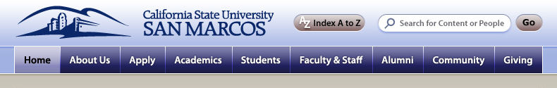
The navbar has two rows. The top row is sky blue in color with the CSUSM logo at left, an A to Z Index button at center, and a search bar at right. The bottom row is navy blue in color and contains nine main navigation buttons set in white text. From left to right, the buttons are labeled: Home. About us. Apply. Academics. Students. Faculty & staff. Alumni. Community. And Giving. The home button is highlighted with a grey-blue background color and black text to indicate that it is the current page. End of detailed description.
Ultimately, after four months of hard work, the first phase of the redesign launched on-time in August 2008 and was widely praised:
“In higher education, it’s almost unprecedented to see major projects move from concept to approval to completion as quickly as our CSUSM website redesign projects did. While it was certainly a team effort, I attribute much of the projects’ quality and efficiency to Dave’s leadership, vision, and high-impact design. His ability to garner support at all levels of the organization was impressive, and buy-in from senior leadership was almost instantaneous.”
Vice President, Finance and Administrative Services (Retired)
Best of all, the working relationship between Communications and IT improved over time, too. I attribute the improvement, in part, to my multidisciplinary background. Because I had previously designed, coded, and written content for websites, I could “speak the language” of any web professional, which led to better mutual understanding and collaboration.
The improved collaboration also played an important role in the early development of my accessibility and inclusive design skill set. The university’s CTO was known throughout the Cal State system as a strong advocate for assistive technology. As a result, we continually worked to improve the accessibility of CSUSM’s websites, and the hands-on experience taught me a lot about making digital experiences accessible for people with disabilities.
2012–2013 Redesign
If the 2008 redesign was revolutionary, this one was more evolutionary. With all campus departments utilizing a common template and CMS, we didn’t need to reinvent the wheel. We just needed to keep things moving forward.
On the design side, CSUSM’s overall marketing presence had matured due to my creation of a style guide and a comprehensive suite of marketing materials (as described in Creative Direction below), so we weaved these design standards into the website. We also empowered academic departments with greater design flexibility to better showcase their offerings.
But really, the 2012–2013 project was more about strategy and content than design. I performed research to guide our content strategy, including:
- a deep examination of website and search analytics
- developing a campus-wide website survey and analyzing the results
- working with a team of student consultants from the College of Business Administration to hold student focus groups about the website
The first tangible result of our efforts was an enhanced CSUSM home page. The biggest research-driven improvement was a navigation element that put ten essential resources for current students front and center, all accessible with just one click:
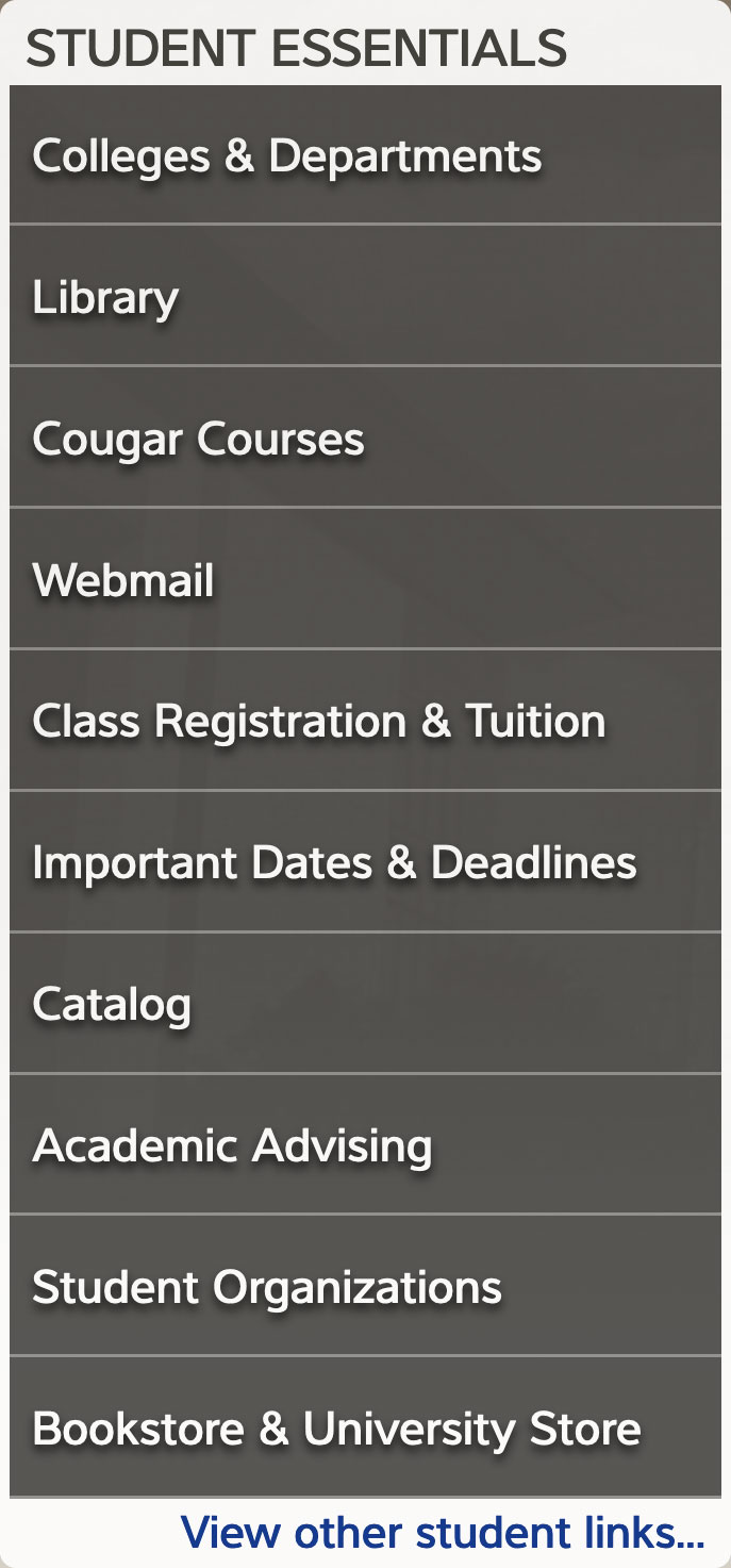
The buttons are stacked vertically and set in a dark grey background color with white text. From top to bottom, they read: Colleges and departments. Library. Cougar Courses (which was CSUSM’s portal / system for online courses). Webmail. Class registration and tuition. Important dates and deadlines. Catalog. Academic advising. Student Organizations. And “Bookstore and university store.” Below the ten buttons is a traditional text link set in blue text on a white background. It reads: “View other student links,” and it provided access to additional resources beyond those listed in the top ten. End of detailed description.
I also helped colleges and some departments implement their updated designs and improve their content. Ultimately, the remainder of the 2012–2013 redesign was completed by other CSUSM staff after I left to run Deedub Inc.
Creative Direction
As my design responsibilities expanded, I became the de facto creative director for CSUSM, crafting a cohesive look and feel that continues to influence all university marketing materials and merchandise to this very day. Notable accomplishments included:
Style Guide, Logos, and Merchandising
When I started at CSUSM, the university style guide was rather bare bones, and simple things like color usage were all over the map. I developed a more comprehensive style guide and continually refined it during my first three years on the job.
For example, when CSUSM decided to move forward with a subtle logo refresh (as described in the Leadership section below), I created primary and alternate logo variations for different use cases. I also lead the effort to select new official fonts, and I developed more well-defined and complementary color palettes for both the university and the athletics program.
Once the style guide was established, I also worked closely with the CSUSM Bookstore to enhance the consistency and appearance of merchandise.
Modular Brochure Suite
When University Advancement expressed a need for marketing collateral to assist in their fundraising efforts, I developed a comprehensive brochure suite.
My biggest innovation was a modular approach that utilized attractive pocket folders and a mix of tri-folds, bi-folds, and one-pagers. This allowed fundraising leaders to mix and match components in a personalized way that aligned with the interests of prospective donors.
The heavy use of one-pagers was also very budget conscious as it allowed us to replace outdated components with updated versions, all without wastefully reprinting the entire brochure suite.
Ultimately, the look and functionality of the templates proved to be so popular that they were adopted throughout CSUSM for other non-fundraising purposes. I frequently worked with campus departments to ensure effective distribution and proper use of the source Adobe InDesign documents.
Steps Magazine
Named after the extensive stairways necessitated by the university’s hillside location, Steps Magazine is CSUSM’s official magazine for alumni and friends.
Originally, my role in Steps was more content-focused, writing some feature stories and providing regular proofreading assistance. However, when CSUSM leadership wanted the publication to literally take the next step forward, I recommended a trusted San Diego-area marketing agency to lead a redesign.
Almost two years later, I developed a budget-conscious plan that allowed us to bring Steps production in-house, thus saving precious resources while building on the success of the agency’s work. Once the plan was approved by leadership, I led the design and production of Steps for three years, constantly improving the finished product.
I also brought Steps into the digital world for the first time ever by publishing feature stories to the CSUSM website, and working with GradMags to bring complete issues of Steps to iOS devices via a native app.
Leadership, Management, and Strategy
Although I didn’t hold a managerial title at CSUSM, I was entrusted with many leadership, managerial, and strategic responsibilities. Beyond the website redesign leadership team, some other examples included:
Supervising Office of Communications student interns
Over a period of one year, I supervised two different design interns. I assigned projects, managed their workloads, and mentored them on a variety of design-related topics.
Teaching a content strategy workshop to campus webmasters
When I noticed some common content issues occurring across various departmental websites, I volunteered to create and present a content strategy and writing workshop. It was attended by numerous campus webmasters and recorded for later viewing by others who couldn’t make it.
Managing vendor relationships and related expenses
I solicited quotes from, and developed great working relationships with, a number of external vendors, including printing companies, signmakers, promotional products and apparel, an agency, and an app developer.
Scheduling and managing Steps Magazine production
Once production was brought in house, I did more than just design Steps Magazine. In collaboration with my colleagues in the Office of Communications, I also managed the production schedule and timeline for every issue. In addition, I actively managed other essential elements of production, from proofreading processes to printing to mailing.
Helping leadership resolve a difficult logo redesign challenge
University leaders had long wanted to redesign the CSUSM logo. However, when their plan was announced and the campus community saw design concepts, students and staff made it clear they wanted to stick with the existing “hills” logo.
To resolve the situation, I designed and recommended an alternative that would preserve the hills while modernizing the adjacent “California State University San Marcos” type. Leadership embraced this idea, and it was also well received by the campus community.
In fact, CSUSM still uses it as its primary logo variation:

Forward Together: The Campaign for CSUSM
In 2012–2013, CSUSM began a serious push to launch its first capital campaign. As part of the effort, the Office of Communications retained the services of a marketing agency to assist with research, strategy, and design.
While the agency’s research was top-notch, we weren’t sold on the conceptual design, content strategy, and slogans displayed in their campaign marketing proposal. However, based on themes uncovered by the agency’s research, I came up with an alternative slogan during a collaborative brainstorming session: Forward Together.
Leadership liked this theme, and I was asked to develop an alternative conceptual proposal, including a logo and sample marketing materials.
Ultimately, both proposals were presented to CSUSM’s philanthropic foundation, and my Forward Together concept was chosen overwhelmingly.
I left CSUSM to run Deedub Inc. full time shortly thereafter, so the extensive work of moving from approved concept to finished product was completed by other CSUSM staff, and they did an amazing job. However, I’m proud that I played an important role in the genesis of an initiative that went on to raise over $55 million for CSUSM programs and student needs.